
![[background image] calm office setting (for a digital marketing & advertising agency)](https://cdn.prod.website-files.com/image-generation-assets/329aeedd-0587-40ca-a1ea-5f5067c9282a.avif)
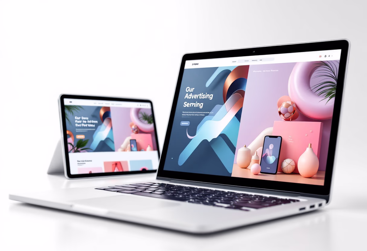
Get a site that looks sharp on your phone, loads fast, and brings in real leads.

Mobile users expect instant results. We optimize your site to load quickly, improving both user experience and Google rankings.

One site that adapts seamlessly to phones, tablets, and desktops, ensuring a polished and professional look everywhere.
Designed with simple navigation, clear calls-to-action, and streamlined checkout flows so more visitors become customers.
See how our mobile-first designs have helped businesses like yours grow online.
Raed Shalabi Ltd. Law Firm
A professional legal site built for trust and credibility
Clean, modern design with strong brand identity
Mobile-first layouts for fast, responsive browsing
Optimized for SEO to attract local clients in Chicago
Clear calls-to-action to schedule consultations
Easy backend updates for ongoing content changes
Monthly site edits
SEO performance reports
Email support
EXI Inc. Electrical Solutions
A dynamic company site designed to showcase services at scale
Mobile-first, user-friendly design highlighting EXI’s expertise
Service pages built to rank for commercial electrical and solar work
Integrated blog for company news and updates
Backlink strategy
Strong visuals and branding to reflect 25+ years in business
Optimized for lead generation with clear contact flow
Conversion optimization
Reputation management
Custom reporting
What our clients say
"Atlas gave our company website the modern, mobile-first design we needed. It’s clean, professional, and easy for our clients to navigate. We’ve already noticed an increase in inquiries since the launch."
![[team] image of individual team member (for a productivity tools business)](https://cdn.prod.website-files.com/image-generation-assets/b81dcf4c-ae7c-44dc-b28f-f0f83d409da2.avif)
"Working with Atlas was seamless. They understood the importance of building trust for a law firm, and the site they delivered reflects our brand perfectly. Clients regularly compliment the design and ease of use."
Over 70% of web traffic comes from phones — don’t lose customers to a site that can’t keep up. Get a mobile-first design built for speed, usability, and conversions.